A reaction to color is one of the fastest, most visceral responses we have to fiber. We often pass up seemingly flat solid-colored fiber in favor of hand-dyed rovings and multicolored fiber with depth and variation. Who hasn’t seen a luscious dyed roving or dreamy batt and wanted to dive into all that glorious color?
Yet sometimes it can be hard to figure out what to do with one of these beautiful creations without muddying or losing some of the color we first responded to. Other times, you may find that you have some more muted solid-colored fiber in your stash that just isn’t calling to you colorwise. In these cases, optical ply blending can come to the rescue, and that flat, solid color can be the color hero of your spinning.
How Color Works
The eye sees color when light is cast upon an object and some wavelengths of light are absorbed, while others are reflected. The color of an object is determined by which wavelengths are reflected back to us. When we see a red object, it is because the red wavelength is being sent back to us. We can also see secondary, tertiary, and complex shades when multiple wavelengths are sent back to our eyes by different-colored objects in close proximity, such as the pixels on a computer screen or the halftone dots on a printed page. This is called optical color blending.
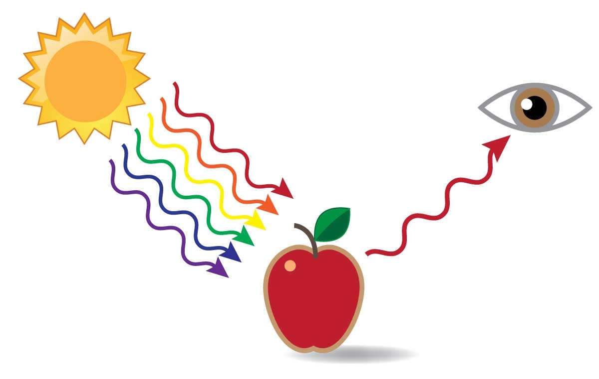
An object that reflects back red wavelengths is seen as red.
We can take advantage of optical color blending in spinning to create new, more complex colors from solids or to change the cast of a multicolored blend without muddying the colors. Optical blending can be used to create gradients, and it can be used to brighten and keep the hues clearer in multicolored fiber.
Creating Secondary and Tertiary Colors from Solids
You can create optical blends of the secondary and tertiary colors by plying solids together. Because optical blending relies on the eye to blend the colors, scale matters. A large scale, with larger patches of color, will result in less smooth blending than a small scale. To achieve the best optical blending, spin fine and ply with a high amount of twist to allow the colors to blur more effectively in the eye. Also remember that your spinning is usually viewed from a distance, in a knitted or woven garment, so it helps to step back from your spinning and view it from across the room to see the effectiveness of your optical blending.
Tints, tones, and shades can be made for any color merely by plying with white, gray, or black. Tints are made by adding white to a clear hue, tones by adding gray to a clear hue, and shades by adding black to a clear hue. At right I’ve made tints, tones, and shades of the primaries by plying with a singles spun from roving that was dyed in a gradient from black to white.

Multicolor Magic
In my opinion, the most exciting solid-color ply-blend effects come from plying a multicolor singles with a solid-color singles. Whenever I am interested in the color effects I might get from a particular bit of fiber, I sample. Just as I probably wouldn’t invest in the effort to knit a sweater without swatching, or weave a blanket without sampling, I also like to sample before I spin up a pound of fiber. If I am to be the boss of my yarn, I need to know what the fiber is capable of producing. Sometimes it is predictable, and sometimes you get a serendipitous surprise!
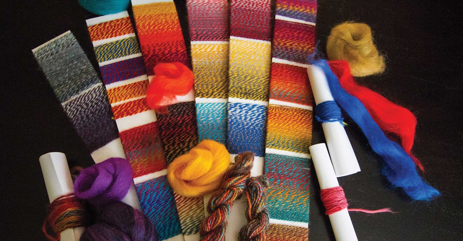
Above I have taken six strips from the same space-dyed multicolored top and plied them with six different solid colors to see how the colors interact; from the results, I’ll determine which solid gives me the effect I am looking for. The original fiber is a combination of brown, rust, gold, and turquoise; it encompasses warm tones, cool tones, and a variety of values. I have plied it with a light brown, teal blue, golden yellow, orange, burgundy, and bright purple. I purposely plied with colors both similar and dissimilar to those in the original colorway.
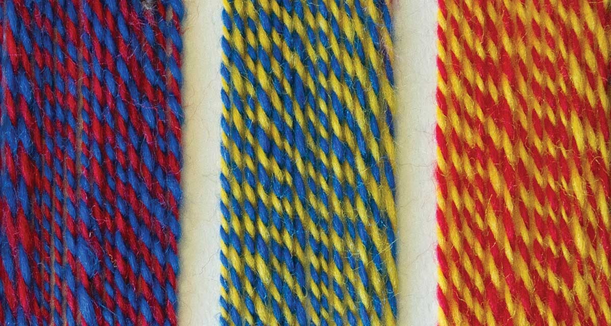
You can create secondary colors by plying two solids.
Notice how each of these colors gives an overall cast to the yarn, letting the variation of the original fiber stand out in contrast or blend in harmony. The sample plied with brown appears more subdued and earthy, while the sample with teal feels like a sunrise over the Aegean Sea. The sample plied with yellow has a sunny disposition and the orange adds a vibrant, juicy, tone. The samples plied with burgundy and purple contrast with the original colorway.
The colors that are more analogous (similar on the color wheel) tend to recede into the background of the yarn, while those that are more complementary stand out as distinct stripes. For example, look at how the gold and red shine forth in the sample plied with teal and, conversely, how the teal shows up in the sample plied with golden yellow.

Fiber that progresses from white to black creates tints, tones, and shades when plied with solid primaries.
The way to create contrast in your spinning is to use colors that either vary in value (lightness and darkness) or that are located far apart on the color wheel. To create maximum contrast, choose colors that are different in both value and position on the color wheel.
Value can be tricky because it is often confused with hue. For example, the values of the yellow and teal are fairly close, even though we automatically think of yellow as lighter than almost any other color. To determine the true values of your colors, try taking a photo with your smartphone, then switching it to black-and-white mode. You’ll be surprised at the results!

The original colorway plied with a range of solids, both similar and dissimilar.
I also made a tint and tone of the original colorway by plying with white and black. Notice how the white tends to fade the color, making it more pastel, while the black causes it to pop out. Black and white are easy to come by, and plying with them is a good way to make a multicolored bit of fiber stretch further.
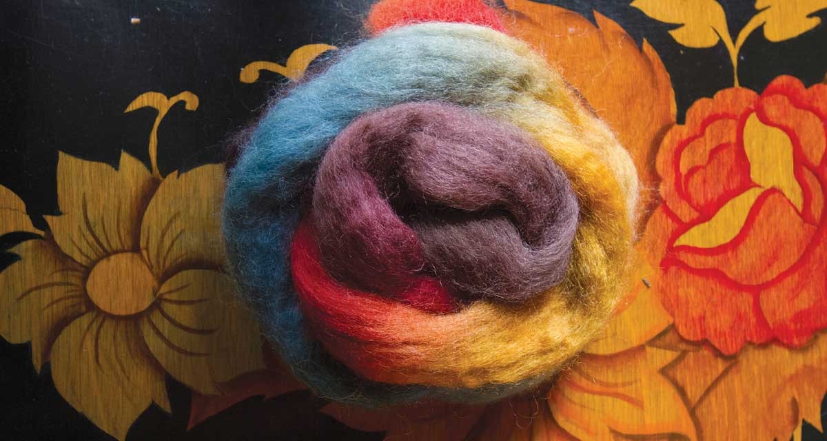
The original multicolored fiber (Taos from Chameleon Colorworks) is rich and includes a variety of hues and contrasts.
Plying for Gradients
One last color trick is creating a gradient between any two colors merely by ply blending. It can be a simple two-ply, three-step gradient: Color A plied with Color A, followed by Color A plied with Color B, followed by Color B plied with Color B. Or it can be a three-ply (or more) multistep gradient. The more plies, the more steps you can incorporate into your gradient, the more uniform your optical blending will be, and the smoother your gradient will appear. At left I have created two three-ply, four-step gradients. In this manner, you can make undulating stripes, long gradients, rainbows, and other graduated color schemes.
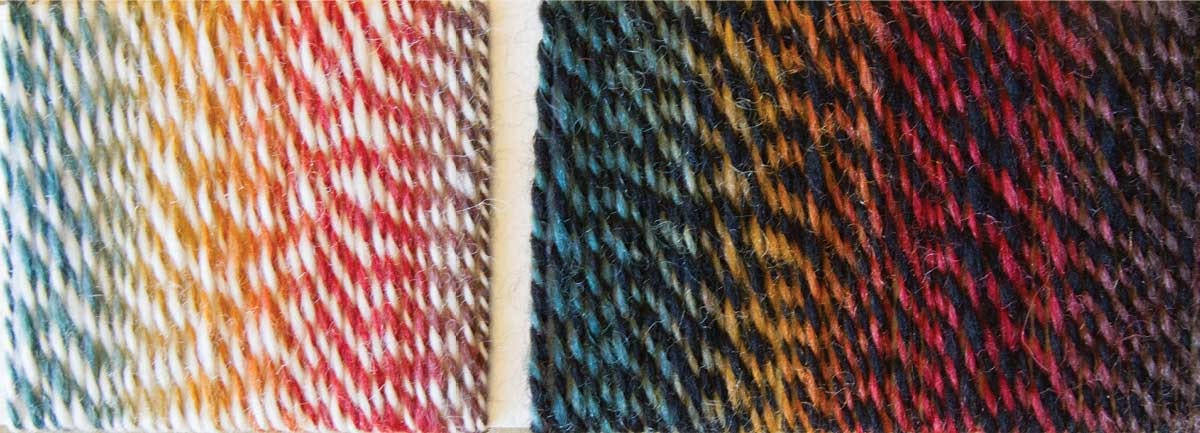
Plying with white or black creates a tint or shade, either fading the color or making it pop.
Next time you see solid, flat colors at your favorite fiber vendor’s booth, don’t pass them by thinking they are too boring to spin. Those solid colors have a world of possibility hiding beneath their monotonous tones. Try a little ply blending to bring the flat colors out of their shells and make your color spinning sing.
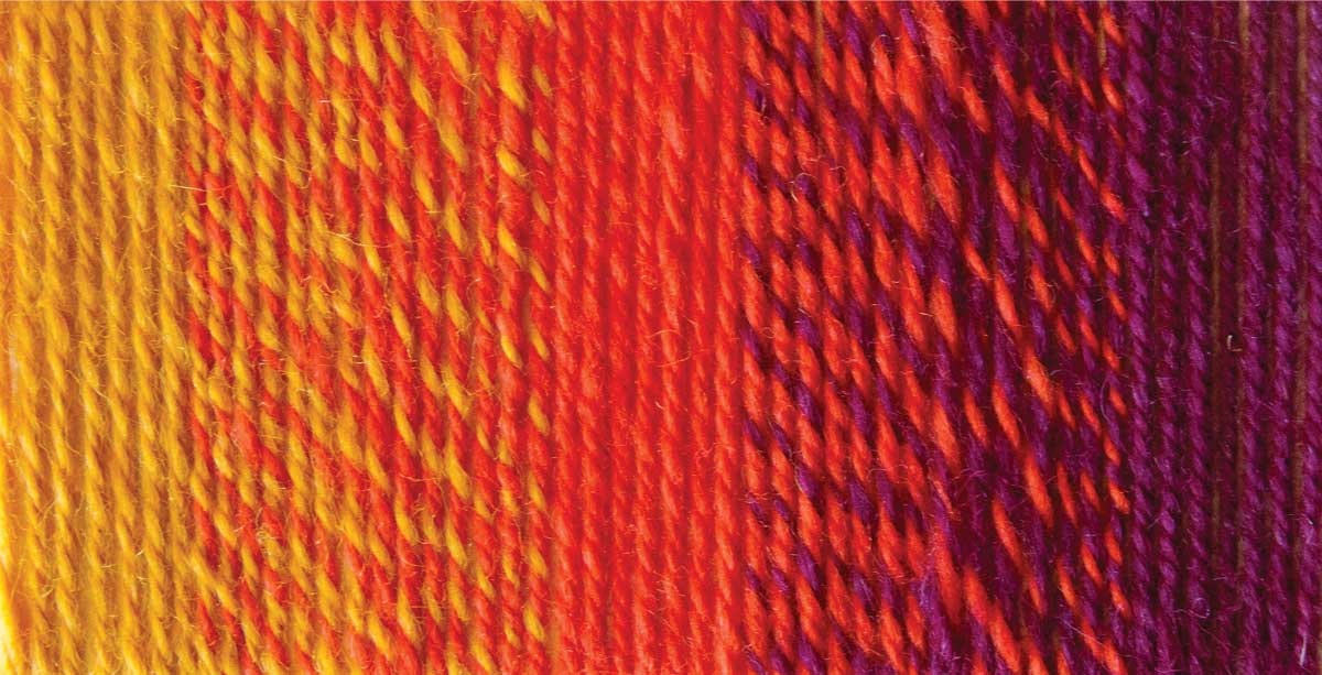
Two three-ply, four-step gradients: From top, three strands of yellow, two of yellow and one of orange, one of yellow and two of orange, and three of orange; from orange to burgundy follows the same pattern.
Learn More
Spinner’s Guide to Color Theory video
By Judith MacKenzie
Janel Laidman is a knitwear designer, talented colorist, and spinning instructor with particular interests in lace and socks.

