
Cape Breton, in eastern Canada, is my part of the world. Here, spring usually brings transitions from cold and rainy to warm and dry. Early spring is marked by plants and flowers in lighter colors, whereas later spring is heralded by more saturated hues. The particularly eye-catching spring flowers often have gradients of color. Spring is marked by transitions and gradients.
Why am I attracted to color gradients rather than solid spring colors? For me, gradients add depth, dimension, and visual interest. Spring flowers have color gradients which are often shades of yellow and red or pink.
 These lilies have petals that display a gradient starting at bright green in the center, through hot pink, to pale pink at the outer edges.
Spring Color Magic
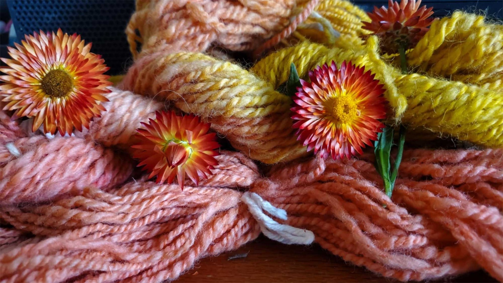
Some favorite flowers, such as roses, daylilies and hollyhocks, contain a beautiful color gradient in each flower that is largely the result of two pigment groups, carotenoids and flavonoids—primarily anthocyanins—that have evolved to attract pollinators. The intensity of color increases as the concentration of the pigments increases. Therein lies the secret of the spring color palettes: The properties of the two pigment groups differ in the response to heat and light, impacting the color gradient of the flowers as spring progresses.
Natural dyers are aware of this difference. Carotenoids are relatively stable and their color changes from mellow yellow to bright yellow, orange and sometimes red as sunlight and environmental temperatures increase. Anthocyanins produce red, purple, pink, magenta, and blue colors. These pigments are far less stable than carotenoids, which often leads to frustration when natural dyers prepare red leaves and flowers as dyestuffs and find that they get yellow yarn.
During the dyeing process, the anthocyanins degrade, but the resilient carotenoids remain. So, as spring progresses and the weather warms, flowers tend to become brighter with a deeper tone of yellow, orange and red-orange as the anthocyanins fade into the background. As I sit near the window at my spinning wheel, I am inspired to reflect these transitions in my fiber work so I can carry spring with me in my handspun garment. Spring transitions in the color palette of my natural surroundings can be mirrored by color palettes and gradients in handspun projects using several techniques.
Two Ways to Create Spring-Inspired Gradients
Optical Blending
You can use pre-dyed fiber and optically blend colors on your carders, combs or blending boards. Look at the gradient starting at yellow and ending at red. Does that say carotenoid to anthocyanin to you? It does to me!
 Annamarie blended this color wheel with pre-dyed fiber.
Explore more ways to work with optical blending in Janel Laidman’s article, “I Ply with My Little Eye.”
Dye a Gradient
By dyeing small handspun skeins in increasingly concentrated dyebaths, you create a palette of progressively more intensely-colored yarn. Whether you use natural dyes or synthetic dyes, the effect is always a crowd-pleaser, giving you lots of options for your next project.
 The set of samples on the left shows indigo dye in progressively darker shades, produced from repeated dips in an indigo vat. The samples on the right show an effect from several different dyebaths, starting with the most concentrated dyebath and going to the most diluted dyebath. This effect is known as “Depth of Shade,” commonly called DOS by dyers. Photo by Pamela K. Schultz
Resources
- Try color blending yourself with Janel Laidman’s article, “I Ply with My Little Eye.”
- Learn more about Depth of Shade in “Pastel to Pure Hue: Dyeing with Value and Saturation in Mind” by Mary Berry in Spin Off Spring 2024.