
Contents
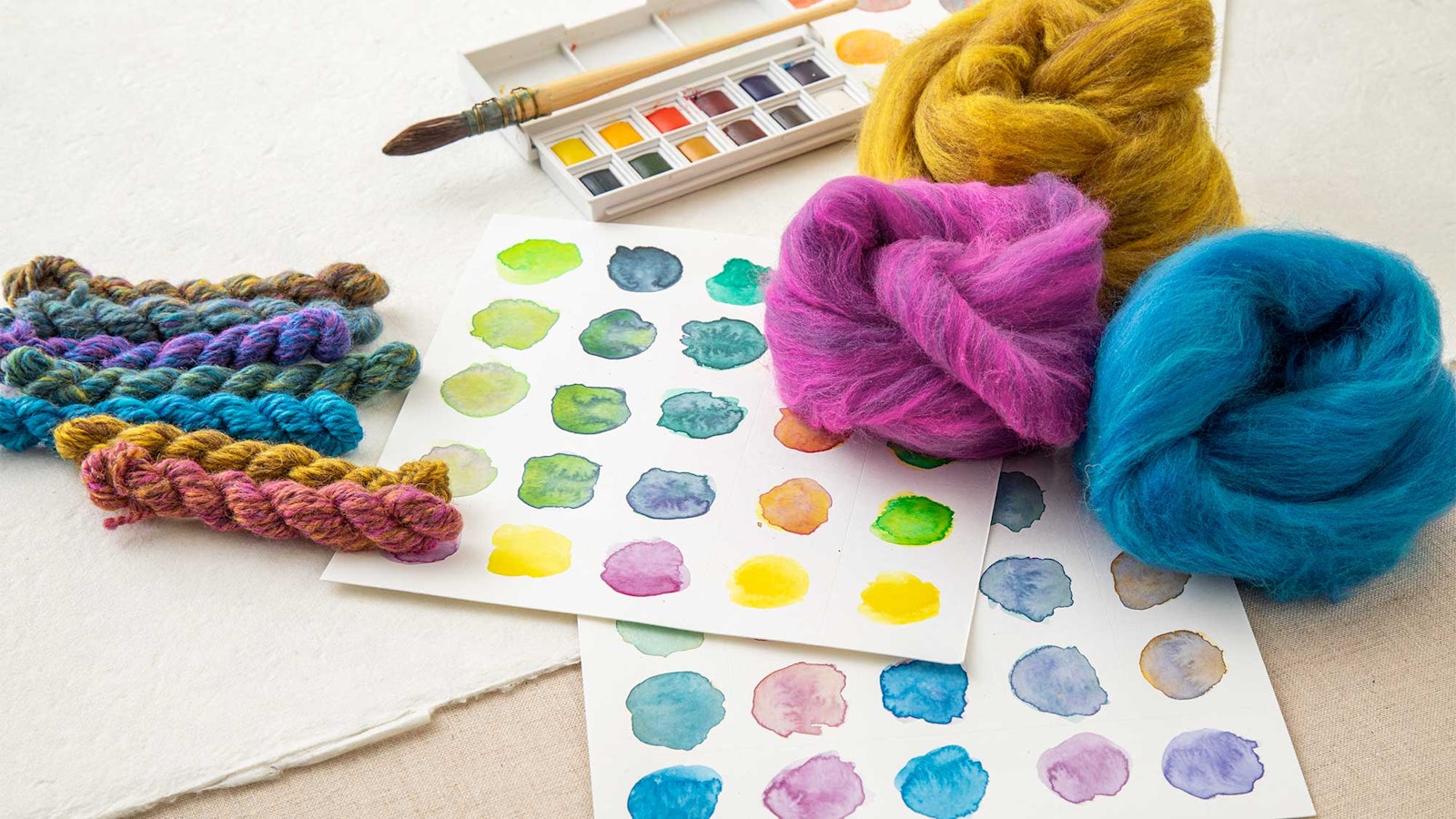
In Spin Off Spring 2026, I asked the question, "What would happen if I made lots of little color wheels with unusual primary colors?" This exploration started when I took a series of painting classes several years ago. While I understood a lot about color theory, I wanted something I could take back to my spinning wheel. Every semester, I painted a new color wheel, and eventually got bored of the predictable color combinations that I got every time. After swapping a few colors, I discovered new color harmonies and new ways to play with color, and you can read all about that process in the Spring 2026 issue.
But a new set of color wheels wasn’t the end goal. I also needed to know how those new colors would interact with each other in order to start planning projects, so it was time to sample. Knitting and weaving are two of my favorite crafts—after spinning, of course—so I set out to make a knitted and woven sampler of each colorway.
 Pamela’s first colorway shifted just one primary color—blue or cyan—into a more greenish aqua hue. She called the result Tropical Brights.
Speedy Samples
For my knitted samplers, I chose to make speed swatches, as suggested by Janine Bajus in The Joy of Color. A speed swatch is easy—you work in stranded colorwork, always knitting two stitches of one color and two stitches of the next color, except at the edges, where you shift your starting color by one stitch every row. This creates a diagonal stripe that is easy to repeat and shows off color interactions beautifully.
Another way to speed up the swatch is to knit it flat, knotting off and cutting your working yarns at the end of every row. This way, you only have to knit—no purls—and you can make a narrower swatch than you might need if you were working in the round.
I chose to knit two rows of each color interaction for my knitted swatches—one row didn’t quite show enough, and three rows would have used too much yarn. For each swatch, I started with one of my semi-neutral colors as the background color, then cycled through all the two-color combinations that were possible with it. Once all color combinations had been exhuasted, I set that color aside, chose a new background color, and went through the next set of color combinations. This is why the color bands get narrower and narrower as each swatch progresses. While it would have been fun to work full-width samples with each possible color combination, I did worry about the amount of yarn it would take, so chose the more economical route. After all, next up I had the woven swatches to make!
 Pamela’s second colorway shifted the yellow primary to a gold color with the addition of natural Shetland moorit. She called the result Jeweled Earth.
Quick Rigid Heddle Gamps
For my woven samples, I wanted something bigger than a pin-loom swatch but smaller than a placemat. I also wanted to conserve as much yarn as possible, so I made gamps with very short warps (about 20" each) on my rigid heddle loom. I was working with an 8-dent rigid heddle, so assigned each color an inch, or eight ends of warp, and eight picks of weft. Because I was interested in seeing as many color interactions as possible, I did not put a dividing thread between each section. After cutting each gamp off the loom, I twisted the loom waste into fringe and wet-finished the sample.
 Pamela’s third colorway shifted the primary magenta to a brick-red color, and the blue or cyan to a dark navy color. She called the result Crayon Box.
Evaluating the Samples
On the knitted samples, I’m most struck by the interactions between the bright colors and my semi-neutral colors—those colors that blend all the colors in the colorway. The more value contrast there is between colors, the more the diagonal stripe shows up. This is important in graphic colorwork, where you really want your motif to be clearly visible. But there’s something interesting happening in the areas with less value contrast—the colors seem to shift and shimmer, like in an Impressionist painting. I know that these could be frustrating to knit with—I had to rip out and re-do several rows when knitting the swatches—but the result could be incredibly stunning in an allover colorwork pattern.
On the woven samples, I find that there are many more interesting color interactions happening, leaving me with lots to think about in my next weaving project. Sure, the bright and bold colors catch my eye first, but then I'm drawn along to some of the more subtle interactions where two semi-neutral colors create a whole new color that defies explantion.
 Pamela’s fourth colorway shifted all three primaries—making the magenta a brick red, the yellow a gold, and the cyan a pale grayed-out blue. She called the result Quieter Tones.
I have to confess that this project has left me with more questions than it’s answered, and I find myself a bit addicted to sampling new color wheels and color combinations. But that’s part of the fun of color theory!
Make sure you’re subscribed so you don’t miss out on all the great patterns and articles coming in Spin Off Spring 2026!